Gradients logos are one of the modern trends. Many popular companies use gradient logos and all the advantages of this method of creating logos.
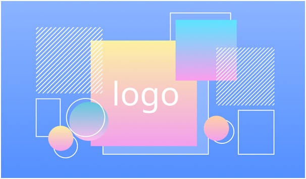
Such logos are filled with various colors and immediately attract the attention of many users, which increases brand awareness and its products, as well as services. Such logos are quite difficult to fake, because it uses various unique colors that attract the attention of consumers.
What is a logo
A logo is an image or text that users associate with a certain brand or its products. The logo performs many tasks, but the main one is the presentation of the brand to the consumer and that is why the logo should be bright and memorable enough.
The logo is located on the company’s products, business cards, websites or pages in social networks. It is the logo that advertises the company as much as possible, and also regularly appears in advertisements for certain brand products. When developing a business, it is necessary to pay attention not only to the quality of products, but also to the reputation of the brand and the popularity of the logo, which directly represents the brand and all its products.
Features of gradient logos
In modern times, the trend of gradient logos is simplicity, despite the many colors that are used when creating a gradient logo. Gradient is a gradual transition of color from one to another. Such logos have a number of advantages, which include:
Attractiveness and brightness
Such logos especially attract the attention of consumers, as they are quite bright, while not causing negative reactions. Most users are trying to solve the riddle of mixing colors and therefore linger their gaze on the logo, and this contributes to its memorization.
Uniqueness
Gradient logos are hard enough to fake. If there is a clear similarity of the logo of a competing company, you can file a claim during which you will receive certain compensation, as well as prohibit the competing company from using this logo.
Wide range of colors
The color scheme of such logos is not limited, which gives freedom of action when creating a logo. You can use corporate colors, or you can use other unique options that become available when using a gradient.
Highlighting certain elements of the logo
With the help of a variety of colors, you can highlight a certain text or image, which will force consumers to pay attention to the desired fragment of the logo.
Famous gradient logos
Gradient logos are quite popular, which is why they are often found in many companies. However, certain logos are quite well-known and are recognized by many people in different countries of the world.
1) Instagram
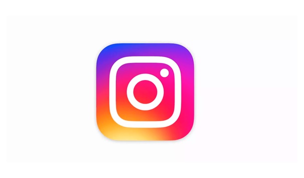
The most popular social network, which is used daily by millions of users around the world. The Instagram logo (created in 2016 and currently relevant) is made in this style. It is updated quite often, but despite this, its style does not change much. The colors of the logo partially change, which is quite easy to do with this method of creating logos.
2) Mozilla Firefox
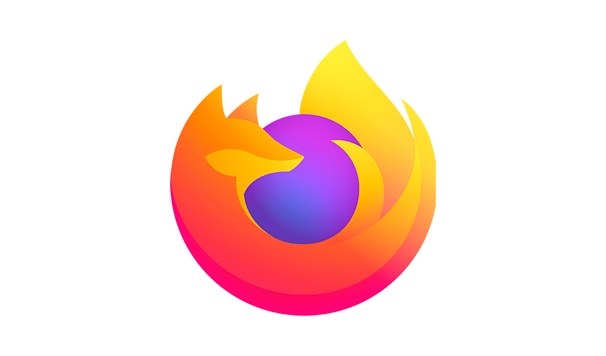
The modern logo is practically not similar to the original logo. The last logo change was in 2019. It has become brighter, due to the use of more saturated colors. The trend of changing the logo has been traced since 2004, when gradually the main attribute of the logo (fox) gradually began to disappear from the logo, but at the same time it regularly became more vivid and attractive.
3) Tinder
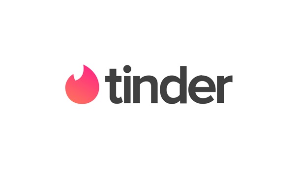
Also, the most popular global brand, which used this method when creating the logo. The logo looks quite bright and attractive, while quite favorably differs from its competitors (dating apps). Perhaps it is thanks to the logo, as well as the functionality of the application, it has become one of the most popular dating apps. One of the Another also popilar app MegaPersonal is a classifieds service for people wanting to MEET NOW! One may respond to ads via phone, by text or email.
You can find many more different examples of popular gradient logos that are known all over the world. Many of the largest companies that rebrand and change their current logo use this method, because it gives the logo additional colors that attract the attention of potential buyers.
Conclusion
Gradient logos are one of the modern trends. Despite the fact that this method of creating logos has existed for a long time and its popularity has been falling, modern designers have given gradients a new popularity due to minimalism, which is ideally combined with this method of creating logos.
Such logos stand out favorably against the background of other logos with their brightness, while they are able to make an aspect on a certain area of the logo, which will leave a certain message for end consumers. It is also worth noting that such logos are quite easy to change, which will save on rebranding, and will also attract additional attention of consumers during the change of the logo color scheme.
Creating logos in this style does not put frames, which allows designers (the owner of the company) to create a truly unique and inimitable logo that will actively advertise the brand, as well as all its products.


