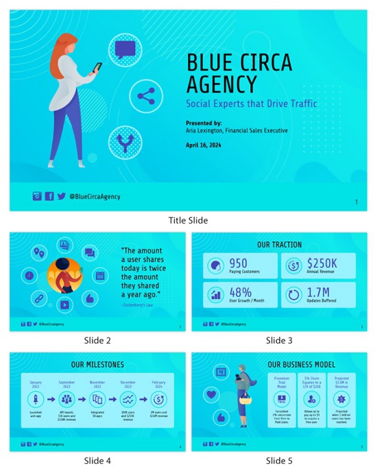
Every business will have to create a sales deck at some point in time unless you’re selling your product exclusively through the Amazon marketplace. This is an absolute certainty because when prospecting for new business, you’ll be asked for one. The bottom line is that if you are pitching to enterprise-sized accounts with complex requirements, you’ll need an effective way to convey your message and convince them why they should select your offering above your competitors.
But here’s the problem with traditional sales decks — they suck! They are boring, long-winded and lack focus or any compelling reason why they should be read by the prospective customer.
A good marketing story needs to highlight real customers rather than endless technical specs of features. It needs to be concise, compelling and most importantly visually engaging.
The good news is that if you follow the advice in this article, you’ll be able to create a sales deck template that gets noticed.
1. Know Your Audience And Customize The Message


Whether presenting to vice presidents or directors of IT, their level of technical sophistication will vary greatly. Some will know almost all about your product like the back of their hand, while others may never have heard about it before — their understanding can range from zero to expert!
Hence, it’s important to understand where they are coming from; do some research on what they know already and focus on presenting information that has not yet been communicated (either directly or indirectly). The goal here is to start a conversation, rather than provide a one-way monologue.
2. Focus On The Pain Points That Your Solution Addresses (not Features)
Too often, sales reps think they need to list all their product’s features in the hope of convincing prospects that it has everything anyone could ever want. This approach doesn’t work because no matter how many benefits you convey, there’s always someone who can ask for more! Hence, instead of focusing on feature comparisons with your competitors in your sales deck outline, take the opposite approach and explain why being different is good by highlighting what you are focused on—the pain points or key business issues which will be resolved using your product.
It’s not about the technology; it’s about what problems it solves for customers. To create an effective sales pitch and business proposal, you need to answer the question: “So what?”
3. Visualize Success For Your Audience
If we were to create a simple equation here, it would look like this:
Emotion + Investment = Decision
Most of the complex decisions that prospects make are driven by emotional factors such as fear, greed and pride, rather than rational reasons such as ROI or cost savings. So if the only thing you do is just list technical features on a slide, how can anyone who doesn’t understand those aspects possibly care?
The point is that people don’t buy benefits; they buy compelling outcomes!
Build presentations that tell stories and describe how customers will be better off as a result of using your product or service. This approach allows you to visualize success for your audience and gets them emotionally invested in solving their pain points, which is what really drives purchase decisions.
4. Keep Slides Simple So That Viewers Don’t Get Distracted By The Design


While there are some compelling reasons for designing a sales deck design with nice-looking graphics, most of us end up sacrificing simplicity for aesthetics or whatever style we feel will impress prospects or clients. Avoid this temptation at all costs!
Sales decks need to be clutter-free and leave plenty of white space on each slide with no distracting imagery which can detract from the core message — a good presentation should never look like a PowerPoint template from hell.
5. Present High-Level Features First Before Drilling Down Into Technical Details
It’s always tempting to kick off your slides with lots of technical jargon, especially if you are presenting to other techies. However, this approach will alienate everyone else who doesn’t understand what that means and hates wasting their time trying to figure it out.
A better way is to clearly explain the business value behind each feature, which then naturally leads to why they should purchase your product or service. You can then get more tactical on how this happens by describing key use cases for your product later in the presentation; if prospects want to know more about specific features, they’ll ask.
6. Use Visuals As Much As Possible
With so many information sources competing for our attention these days, humans have been programmed to recognize visual cues rather than read every word on a page. So instead of making prospects read slides word-for-word (which they will hate), use images to draw attention to the most important information you want them to understand.
Slides should tell a story and should be designed so that they don’t require much additional explanation from your side. Remember, if prospects have questions, they will ask.
7. Add A Summary To Each Slide


At the end of your presentation, prospects will need to ask questions and seek further clarifications on what you explained on each slide. If they can’t remember which slide contained which information or want to discuss a specific feature in more detail, they’ll hunt around looking for a card with a number on it.
Make this process as easy as possible by adding “bullet points” at the bottom of each slide which clearly summarizes the content on that page.
Not sure where to get started? Check out Venngage and see tons of sales deck examples. Don’t wait and make the best sales deck ever today!


