Do you want to make improvements to your website this year? There are different ways to improve your site, so you’ll want to ensure you know all the best tips. As you update your site, they’ll start to come naturally to you.

And, if they don’t, you can always reach out to an Atlanta web design company. Here are seven web design tips you can’t ignore in 2022!
1. Keep Your Site Simple
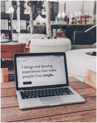
First, you must keep your website as simple as possible. You don’t want too much visual clutter on the screen. That way, your audience can easily find what they’re looking for.
The main goal of your website should be to communicate with your audience. Whether you’re a business site wanting to promote your products or running a blog- keeping your website simple will significantly benefit your message.
You can work on simplifying your website now. Start by removing unnecessary elements and focusing on the most important ones. Then, limit your color scheme to only two or three colors.
It can be tough to remove elements on a website you’ve spent a long time working on. So, don’t hesitate to contact a web design agency if you need some help.
2. Use Keywords in the Headline
Next, you’ll want to ensure that you use keywords in the headlines on all your pages. This process is essential to SEO, so you shouldn’t skip it. If you haven’t done this until now, it’s a good idea to look over your old pages and make changes.
You want the headline to capture your audience’s attention, so they stick around to learn more. That also means you want it to be short and to the point.
Suppose you want to increase the traffic efficiently. You should use your main keyword in your URL, subheadings, meta description, and throughout the body copy.
Overall, best SEO practices are essential to your website’s design. You’ll want to ensure you do your best to keep up with them. Ignoring keywords would be a disaster for your site!
3. Include Parallax Scrolling
This year, parallax scrolling has become very popular- and for a good reason! Parallax scrolling causes the background to move slower than the foreground, which makes a strong field of depth on the webpage.
There are plenty of different ways to use this effect and get great results. Parallax scrolling is perfect for telling an engaging story and adding an interactive element to the page. Including unique animation with the scrolling effect can make it even more interesting to look at.
If you don’t want to include this particular effect, adding animated elements to your website can also impact the viewer. Consider using short GIFs throughout your website, but don’t use too many that it becomes a distraction.
4. Consider Where You Put Social Media Links

Next, you may want to move where you have your social media links. At the same time, they’re excellent for increasing engagement and building an audience. You don’t want your social media links at the top of your web pages.
Social media links being one of the first things your audience sees is bad because they can draw them away from your site before they even check out your content. These links can be very distracting since interested viewers may want to click on them before they forget to follow you.
Instead, put all social media links at the bottom of your webpage. That way, they can check them out after reading through your content. If they liked your content, more people would click on them naturally when you put them at the bottom.
5. Adjust Your Color Palette
It’s also essential to review your color palette. You want the main color scheme on your website to align with your brand colors, which make up the more significant portion of your brand identity.
Many experts recommend that you choose three colors for your color palette. You want to have the main color and secondary color. Then, highlight specific areas of the page with an accent color. The best way to use color in your website design is using the 60/30/10 rule.
This rule states that:
- 60% of the color on the page should be your main color
- 30% should be the secondary color
- Only 10% should be the accent color
If you’re using too many colors, then it’s time to adjust your color scheme. You want the colors to feel cohesive and not overwhelming to the viewer.
6. Use Hierarchy
It’s also vital that you use hierarchy on your website. Hierarchy refers to how you arrange the elements on the page- you want to do so in a way that you draw attention to the most important ones first.
For example, the most prominent image or text usually makes us look at it first. You’ll want to build the rest of the site’s hierarchy with that as the main element. Hierarchy can also consist of various grid structures to organize elements.
In general, you want the most critical pieces of information at the top and the lesser ones at the bottom of the page.
7. Add Social Proof
Finally, you’ll want to add more social proof to your website. Essentially, you can use social proof to support claims you make on your website. For instance, you can offer customer reviews on the page or mention brands or websites that support your site.
Your web design must include this element because you want your viewers to trust you. By doing so, you’ll increase your reputation in your niche. Over time, this can help your website attract a larger audience.
Don’t Forget These Tips!
Overall, you must use these tips this year- you don’t want to forget them. Ignoring these tips can cause your competitors to absorb your audience. You must update your site frequently, so you’ll want to make sure that you keep these ideas in mind.
In other words- give them a try next time you can!


