When operating a business, generating customer feedback is one of the most complex activities that seem draining. You need a list of robust survey questions that will enable you to get more insights from your customers. Also, you need to have an excellent distribution system that will enable you to share the survey with the right audience.


Most people prefer sharing the questions on a quartile basis to make it easier to access a wide market audience. However, you need to understand that survey questions do not present themselves in an orderly manner. You need to put in place a strong team with an incredible personality to sift through the data and collect vital insights that will enable your business to grow.
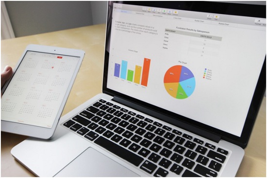
When you want to analyze survey results, you need visualization such a Comparison bar chart, and a Likert scale chart or a Scatter plot chart. This will make your work easier since you will have all your data processing needs to be sorted.
Analyzing Survey Results
1. Sort Your Survey Questions
You need to understand how survey questions are arranged and analyzed. Also, you should be keen on the overarching survey questions that you intend to solve. This is mostly related to how customers tend to rate your business brand based on performance and the quality of services offered. Consider the survey questions that are focused on answering such questions.
To enhance the quality of the results you get, you need to segment your survey questions into different sections depending on the nature of the questions. These sections include:
• Open-ended Questions
Open-ended questions mainly focus on asking respondents more about their opinions regarding various aspects. These types of questions allow the readers to give further explanations regarding various aspects of the business. They give you room to understand the reasons behind the customers’ choices and interests.
• Close-ended Questions
These categories of questions give the respondent a limited number of choices when answering questions. They don’t allow respondents to explain their answers since various aspects limit them. Note that asking various questions is vital since it enables you to get a bunch of answers that suit your needs.
2. Understand the Statistical Significance of the Data
Always remember that not all the data you collect is as reliable as you think. When doing statistics, you need to understand that everything is relative. Also, the respondents must accurately represent the entire market audience to make it easier to collect important information that will help in decision-making. The people you use to conduct the analysis need to represent your exact market audience perfectly.
Once you get to learn and master the statistical significance of your data, you will be better positioned to get accurate results that you can comfortably use to run and facilitate your business operations. The goal is to ensure that the respondents are willing to deliver accurate feedback based on your questions. This means that you need to craft questions that intrigue the readers to respond to the survey.
3. Compare the New Data with the Past Data
Even though the current data plays a huge role in ensuring that you are always updated all the time, it should be closely compared to the data sets that you collected in the past. This will enable you to gauge whether your brand is making progress or you haven’t attained any milestones. For instance, if the past data says that 33% of the respondents are likely to recommend your brand, you need to compare it with the current results.
If this is the first time you are analyzing Survey results, you need to use this data as a benchmark for future data comparison. Once you have compared the values, you need to evaluate whether the results are positive or negative. You can use this data to compare your results in the future, depending on your survey duration, to help you identify your position in the business.
After the comparison, you should share the comparison results with your team members to ensure that everybody within the business is on the same page to enhance your business’s consistent growth and development. However, the mode in which you present the data is key since it enables your team members to understand the insights you are trying to generate from the data.
4. Analyze Quantitative Data First
Quantitative data is a basic necessity during data analysis since it plays a crucial role in statistics, especially when drawing conclusions. Even though qualitative data also significantly impacts survey results analysis, the entire information becomes subjective and calls for a debate. To make the long story short, always begin by analyzing quantitative data to enable you to conclude faster.
However, these metrics limit you on the close-ended questions since they can be easily converted into numerical data and metrics that you can comfortably use in your data presentation. When the data is quantified, comparing and identifying customer trends and behavior becomes easier. When you begin with quantitative data, it can help you understand your qualitative data without straining.
5. Identify the Difference between Causation and Correlation
When doing a survey, it is important to understand the difference between causation and correlation. These are the baselines of any survey, and they do not change regardless of the conclusion you get after data analysis. When you realize that two aspects are closely related, it does not necessarily mean that one aspect caused the other.
When you realize that when one aspect changes, the other one also changes, it means that there is a third variable affecting the two. This means that you need to focus on finding the third variable to make your work easier. However, most people neglect this crucial element since they do not understand the difference between causation and correlation.
To get reliable results, keenly note the difference between the two vital elements. This will simplify the difficult section that requires detailed interpretation, and you will be good to go.
Bottom Line
Using data visualization such as Likert charts in your survey data enhances the discovery of trends and insights. Researchers have revealed that 74% of managers who use data visualization in their data operations tend to uncover insights easily without the need to involve the technical staff in the process. When conducting a survey, you need to be mindful of the data visualization tools you choose to ensure that you generate quality outputs that you can use in decision-making.


